

Dashboard Design Tips: Learning from the Google Trends Dashboard
- Brent Jones
- Sep 4, 2018
- 6 min read
Updated: Jul 25, 2020
Creating a Professional Looking Dashboard
Google Trends is a really neat tool anyone can use to compare and contrast what people are searching. If you search for "Power BI", for example, you can see in graphical format the popularity of this topic in a number of ways. Google is known for having a simplistic design, and Google Trends is no different. They use a minimalist approach to their dashboards while accomplishing the task of presenting of relatively complex data to a large audience.
You can view this full dashboard here.
I'm always trying to improve my designs, so what better way than to learn from the pros over at Google. I hope they don't mind... In this article, I'd like to dissect each component of the Google Trends dashboard, in an attempt to understand how they use a simplistic design for data visualization.
Google's Audience is Huge
Before we begin, we need to understand that Google developed this dashboard for a very, very large audience. According to smartinsights.com, "... the number of daily searches on Google - 3.5 billion, which equates to 1.2 trillion searches per year worldwide." Not all of those 3.5 billion use Google Trends, but it's safe to say that any percentage of 3.5 billion is a big number - Probably larger than most of our company sizes. So, obviously they need to make their dashboard as simple and easy to understand as possible. If you are wondering whether or not your dashboard is too simple or too complex, consider your audience and refer to this Google Trends dashboard as it can serve as a good benchmark for your own designs.
First off, Google presents this data to us in three main ways:
Time series
Location
Summary Lists

It's also worth pointing out that there are two sections (apart from the headers section with the filters). These sections each contain 2 charts; the first section has the column chart and line chart. The second contains the map and list. I think this is important to recognize, because in my own reports, I tend to separate each chart into it's own corner of the report. Having charts grouped into sections like Google has it, makes it easier for the user to comprehend the information.
I'll be using Power BI to try and recreate these dashboards, and explain the key points for each of them. The tiles on the Google Trends dashboard already look and feel pretty similar to the standard dashboard tiles on Power BI, so it shouldn't be too hard.
Setting Up
You can get the data directly from the Google Trends dashboard via the 'download' button on any of the tiles. I downloaded 4 separate CSV files:
multiTimeline.csv - For the time series line chart
geoMap_SubRegions.csv - For the map chart of regions
geoMap_Metro.csv - For the map chart of metro areas
geoMap_City.csv - For the map chart of city areas
Using a Consistent Theme
Probably the most important key to creating a professional looking dashboard, is to use a consistent theme across all items. This includes color, font type, size, background, etc... Google is known for it's white background and colorful font. The Google Trends dashboard follows this same principle, so you'll notice each tile has a white background, with the visuals containing the familiar color theme.
I'd like to point out the light grey background. This serves as a good backdrop to provide a clear dividing point between each of the major sections.
Be Conscience of Your Choice of Color
I'm really bad a choosing colors myself. It's tempting to just "pick a color that looks good" from the standard choice of colors. However, color themes are simple to obtain on the web. There are a number of great websites that will create a color theme for you. Paletton is a good one I've used in the past. It's simple and easy to understand. They even give you the color codes in several formats.
Since we are trying to replicate Google's color theme, we can simple ask Google what that is. I came across CreativeMarket.com where I got this image:

If you have the color codes, Power BI has a nice color theme generator that will generate a color theme JSON file which you can use to apply to your dashboard. We can just plug in the codes above into the generator.

For the background, I entered the hex code for a light grey. The foreground is all black, and the table accent is a darker grey. For more information on these values, you can read about it in detail on the Microsoft docs.
You can copy and paste the code in notepad and save it as a JSON file if you'd like to use it yourself:
{

"name":"Google Theme",

"dataColors":["#3369E8", "#D50F25", "#EEB211", "#009925"],

"background":"#eeeeee",

"foreground":"#000000",

"tableAccent":"#A0A0A0"

}
You can import this theme via the "Switch Theme" button in Power BI:

Now there is a nice Google color scheme for our dashboard to get us started! I'm also going to manually change the background of my report page to the light grey.
Note: You need to enable the "Custom Report Theme" in the preview feature options.
Line Chart Design
Now, we'll tackle the time series line chart. Once the data is imported into Power BI, it's a relatively simple process of just inserting a line chart, and selecting the values and axes.
We can see that the graph's structure is pretty much the same, and the theme we imported applies a familiar Google color scheme automatically. A couple manual things I'll do:
Change the background of the chart to white.
Remove the X-axis grid lines.

Column Chart Design
Now lets take a look at that column chart to the left of the time line. This chart is much smaller than the line chart. It serves as a compliment to the bigger line chart, and creates a nice balance between the main focus of the dashboard and the other details. For the formatting, I'll do the same thing as we did for the line chart.
Change the background to white.
Remove the Y-axis altogether.
Widen the columns.
Remove legends from both charts.
Remove Titles from both charts.
Add a custom x-axis label ("Average").
Increase x-axis text size to 14.

Alien Tip: Use the x, y, width and height properties under the general section of the formatting tab for your visuals. This ensures a consistent structure for your design. Even a difference as small as 1 pixel can make something look off.

Here's what I have so far.

I'd like to have a bit more margin on the top and bottom of the graph. We need this extra margin for the title section as well. We can accomplish this by creating a text box and 'sending it to the back'. I'll do just that and insert a line underneath.

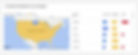
The Map
Now for the map. I find it interesting here, because normally we see maps presented in a large format. Google is going with a small-medium sized graph. To get started, I copied the Title text from the previous "Interest Over Time" text box to match the dimensions in this new section. I chose the "Filled Map" as opposed to the "Map" option in Power BI.
Google's map colors in each state with the most popular category. The color intensity represents the percentage - a higher percentage means more searches, which means a stronger color intensity.
In order to accomplish this, we need to calculate the max value for each row among our categories. Unfortunately, the DAX formula for MAX() only accepts two columns/values - meaning we can't use this because we have three categories (columns).
Fortunately, Power Query comes to our rescue with an M function: List.Max(). In the Power Query editor, create a new custom column. I'm using the following formula:
Power Query (M):
= List.Max({[Power BI],[Tableau],[Qlik]},1)
Click 'OK' and now we have our max value. I've named this column "Most Searched". Save and apply the changes to return to the dashboard. Now that we have a max value, I'm using DAX for a simple logic function.
DAX:
Most Popular: =
if(Region[Most Searched]=Region[Power BI],"Power BI",
if(Region[Most Searched] = Region[Tableau], "Tableau",
"Qlik"))
I'll use this new "Most Popular:" column in the Legend field for the map. I'll drag the "Power BI", "Tableau", and "Qlik" fields into the tool tip field of the map. Lastly, I'll put the "Most Searched" field in the Color Saturation field.

Make sure the colors match up with the charts we already have. I needed to manually change them to match.
The List
For the list, I started out with the standard Power BI table. The main thing here is to increase the "Row Padding" within the Grid properties. I increased this to 14px, resulting in about 5 rows fitting in the window.
I then added the category values for Power BI, Tableau and Qlik. I used the Conditional formatting to replace the values with a data bar. I couldn't get it exactly like Google has it, but it's pretty close. Lastly, I changed the row dividers to a lighter grey color.
Alright! I think we've gotten something that resembles a Google Trends dashboard!

Key Takeaways
Here are some of the key things I went over in this article:
Use a color theme
Use consistent colors
Less can be more (not every chart needs a legend if the colors are consistent)
Expand text boxes to create sections
Use a lighter color background
It's okay for some charts to be small and other to be big. It can create a nice balance.
You can view this Power BI dashboard here. Let me know in the comments if you have any additional tips.
Building an Access database? Check out my ebook here!


