Building a KPI Dashboard for a Recruiting Company!
- Brent Jones

- Oct 19, 2018
- 3 min read

For the past couple of years I've worked for a consulting firm and created several dashboards for various purposes. In this blog, I'll go over some of the designs I used for building a dashboard geared towards recruiting and consulting firms.
Employee Dashboard
This dashboard is created for both upper management as well as employees (producers). It features a main list of various KPI's on one page, and the other contains graphs for hourly margin over time, number of consultants, etc.


RLS
The dashboard would contain an RLS implementation on the graphs page so that the data would either filter down to a team level or individual level, while leaving the main list open for all to see (no RLS filtering).
We found that employees liked to see how they stacked up against others (on the main list), but would like to keep their historical data somewhat private (for the graph page). Of course, their direct and upper managers would be able to see their team members stats on the graph page. See my post about RLS Implementation to learn more about the specific steps.
Filters
Choosing the right filters can have a major impact on the reception of your dashboards. As such, a major request I had was to have filters on the main list. Too many can be overwhelming while too little can prove uninteresting. The one I'm showing here has only two filters for branch and tenure, but others I've created had an additional one for role (recruiter or account manager). These are just standard Power BI filters with the orientation set to horizontal. You can do this in the formatting section of the filter settings.

Depending on your needs, I think having 2 - 3 filters is about right. Getting over 4 filters may cause information overload for your users with visual clutter.
Remember, the point of a dashboard is to quickly and efficiently consume information from data. As a dashboard designer, you should choose your filters with careful consideration.
Graphs
There are really three points of information being conveyed on the graphs page:
Number of Consultant Starts Over Time
Consultants on Billing Over Time
Average Hourly Margin Over Time
The number of consultant starts over time is broken into contract starts and permanent position starts, represented by column/bar graph. These graphs have the functionality to drill down into quarter and month. It may be nice to set up some Power BI bookmarks for yearly, quarterly, and monthly views to quickly drill down both graphs at the same time.


Your boss may want a third graph for total starts, combining the contract and permanent position starts. I left this one out because it would've felt too busy on screen. If you do need a graph for total starts, I would recommend creating a separate, specific page for starts with all three graphs.
The consultants on billing graph is simply a line graph plotting the points over time. A line graph makes sense here because this KPI inherits a sense of continuation. i.e. consultants on billing for next period results from starts this period minus the stops (or terminations) during this period. I used a column graph for the starts because one time period's value is not dependent upon the previous period's value. The hourly margin over time is a line graph for the same reason.
Each graph has a related metric to the right of it. I chose a YTD metric, but a rolling 12 month KPI would go just as well. I think it would be safe to include both if the text is small enough.

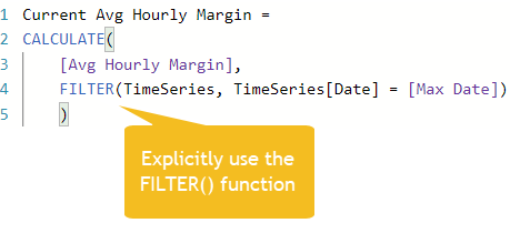
Alien Tip: When creating some of the measures, I ended up getting the following error on one of my calculations: "A function 'CALCULATE' has been used in a True/False expression that is used as a table filter expression. This is not allowed."

You can read the official cause and workaround from the Microsoft documentation. Basically, a CALCULATE() measure cannot use another measure by itself to apply a filter. We need to use the FILTER() function to remedy the situation:

I hope this provided you with some useful insights. Let me know in the comments what you thought! If you have any questions, send me a message!
If you want to improve upon your DAX skills, check out Supercharge Power BI by Matt Allington:


Comments