4 Easy Steps to Make Power BI Look Good (part 2)
- Brent Jones

- Mar 21, 2022
- 3 min read

Continuing from part 1, are you still struggling to get Power BI to "feel" professional? Maybe there's something lacking that you just can't put your finger on? Try these 4 steps to make your dashboard look and feel amazing.
Use the gridlines to line everything up
Maintain order layer
Disable header icons
Avoid filter friction
1. Use the Gridlines to Line Everything Up
You can toggle the gridlines via the "View" tab, in the "Page options" section.
There's also a "Snap to grid" option which can make laying out all your visuals quicker.
The "Lock objects" toggle is great if you need to share the power BI file itself with a colleague. This will make it so all visuals stay in place and cannot be moved around on the canvas. This, in affect, makes the user experience feel much better when on the desktop. Keep in mind this option does not affect the online version of your dashboard since everything is read only anyways.

2. Maintain Order Layer
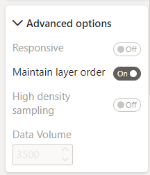
If you have any visuals that overlap, you may have noticed that clicking on a widget that lies behind another widget, will end up covering up the widget in front of it, so long as said widget remains selected.


To prevent this from happening, enable the widgets "Maintain order layer" property. While this doesn't have any effect on the desktop, if you view this on the online version, the background widget will remain in the background even if you select the background widget.

3. Disable Header Icons
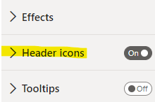
Hovering over any widget will automatically show the widgets header icons. Header icons are nice to have when the widget benefits from having it; i.e. drill down. Otherwise, it is a major distraction, and contributes to your dashboard feeling messy and unprofessional. These can be disabled in the widgets properties. Unfortunately, this only takes affect on the online version of your dashboard.

4. Avoid Filter Friction
What do I mean by this? This is getting a little into dashboard design theory, but let's say you have a static filter for a date range AND you also have a widget for YTD Sales.

If the user selects a date range outside of the current year, what should the YTD Sales widget show? Blank? $0?

We can of course code the DAX to ignore the date filter so that it always shows the YTD Sales. We now also need to consider if it should also ignore other filters. See how this complicates things? It adds friction to the users consumption of the report. The user needs to remember that the YTD Sales widget is not affected by some or all filters. Keep in mind, dashboards need to be simple to understand. You as a developer cannot afford to waste time explaining to your boss which widgets are affected by which filters every single time they look at it. It would be much easier to avoid this situation altogether. There are two things you can do to remedy the issue.
a) Remove the static filter. If you dashboard doesn't have any static filters, you will not run into this problem.
b) Place your widget in a visually distinctive and separate section from the filter (re-arrange the layout). If we put the filter in a different section, it will support the users understanding that this widget is not affected by filters. You will also need to disable all interactions for this widget.
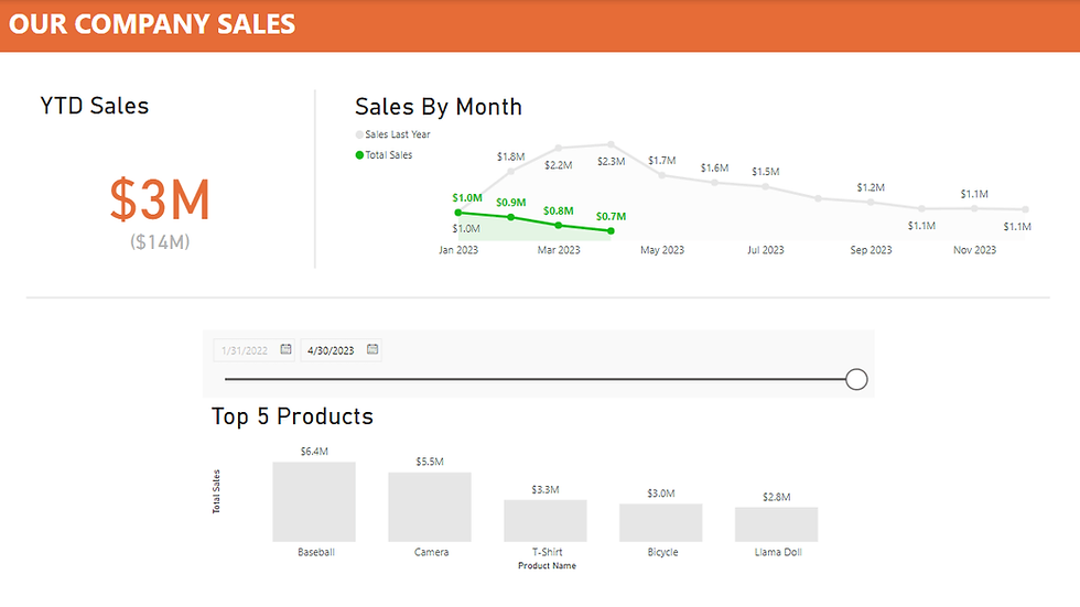
Here's our original dashboard with a date filter on top.

Here it is re-arranged in a more understandable way. The date filter only affects the Top 5 Products widget.

Use the Edit interactions to remove the filtering affect on other visuals.


Cheers!


Comments